Amtrak Case Study - Redesign
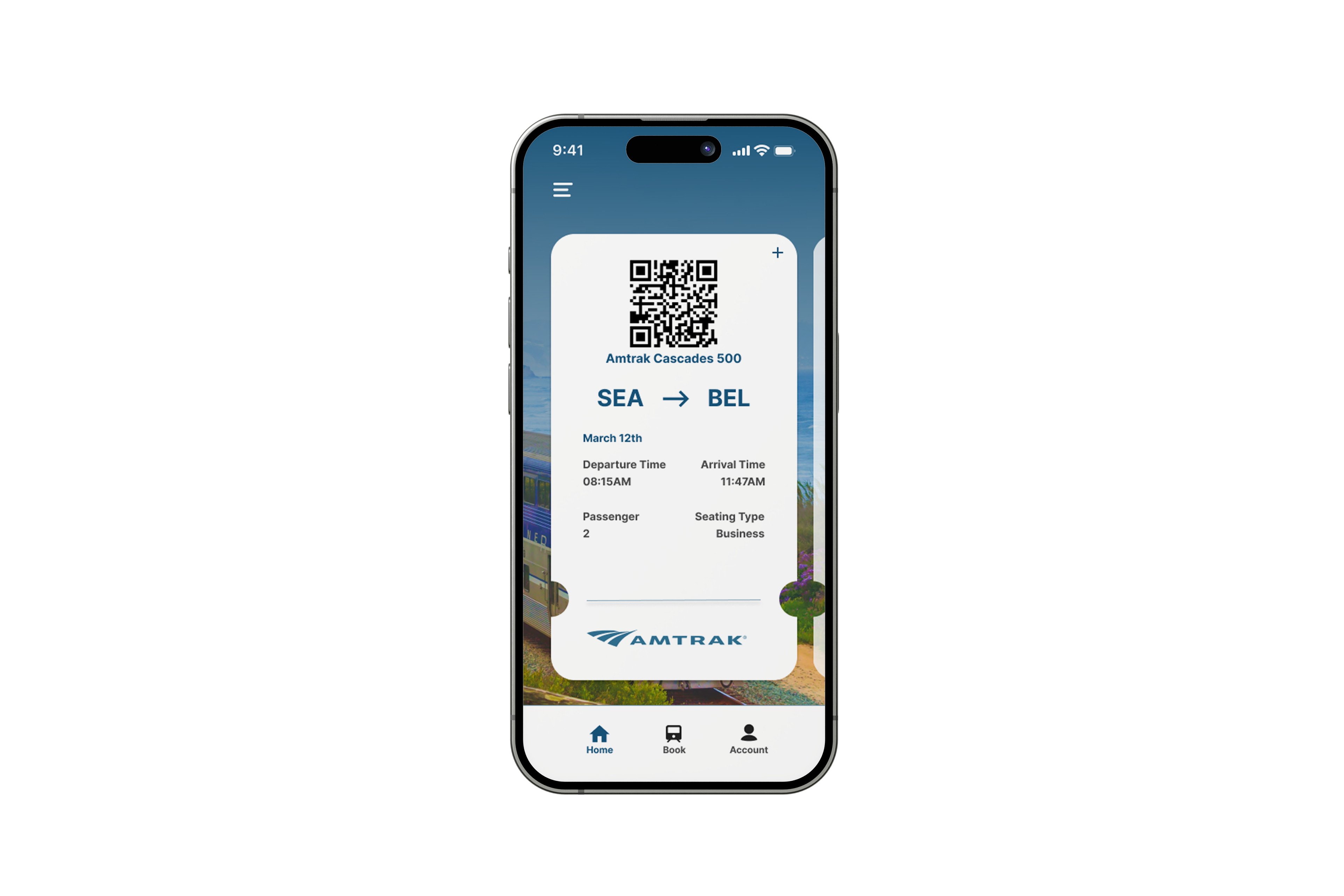
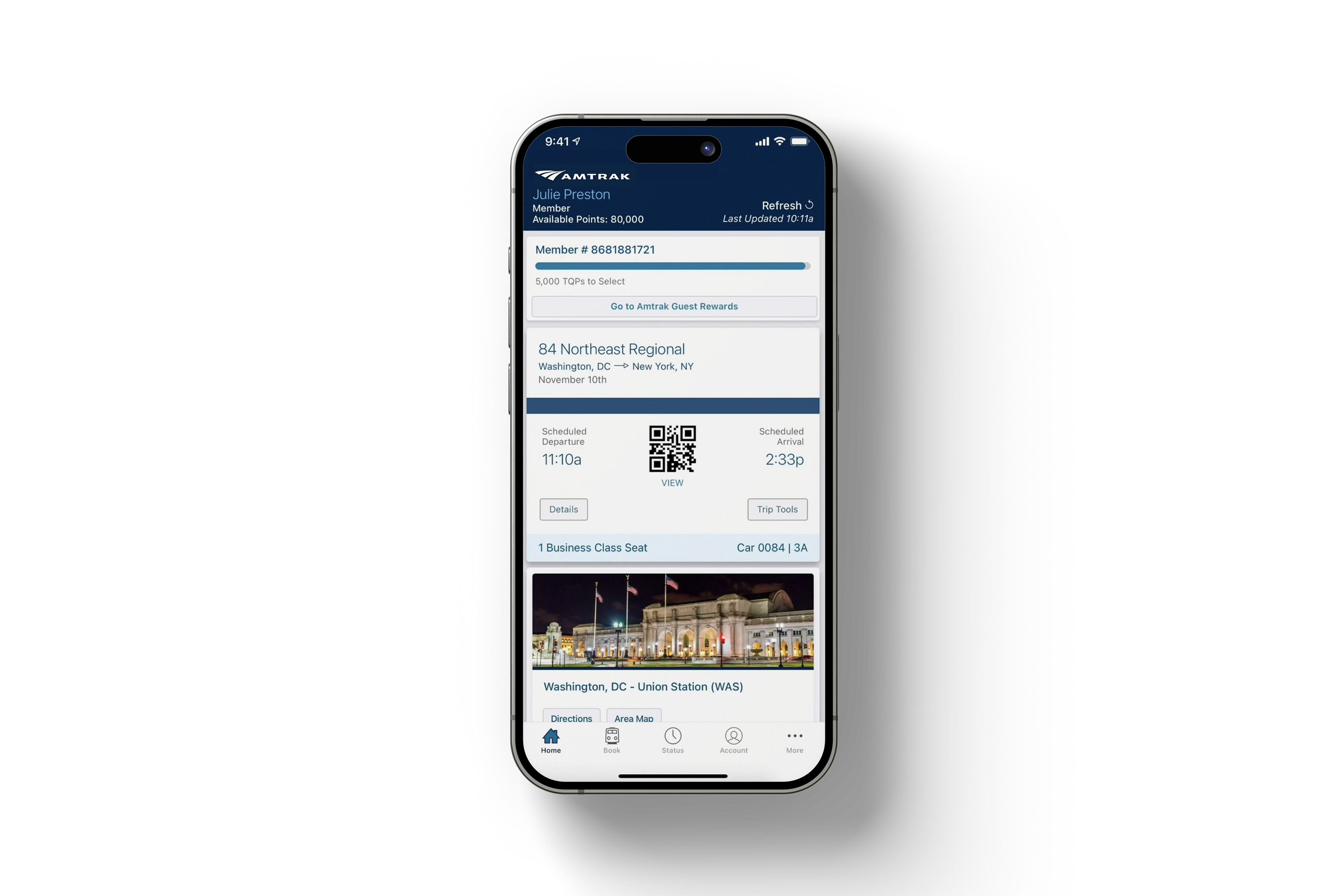
Home
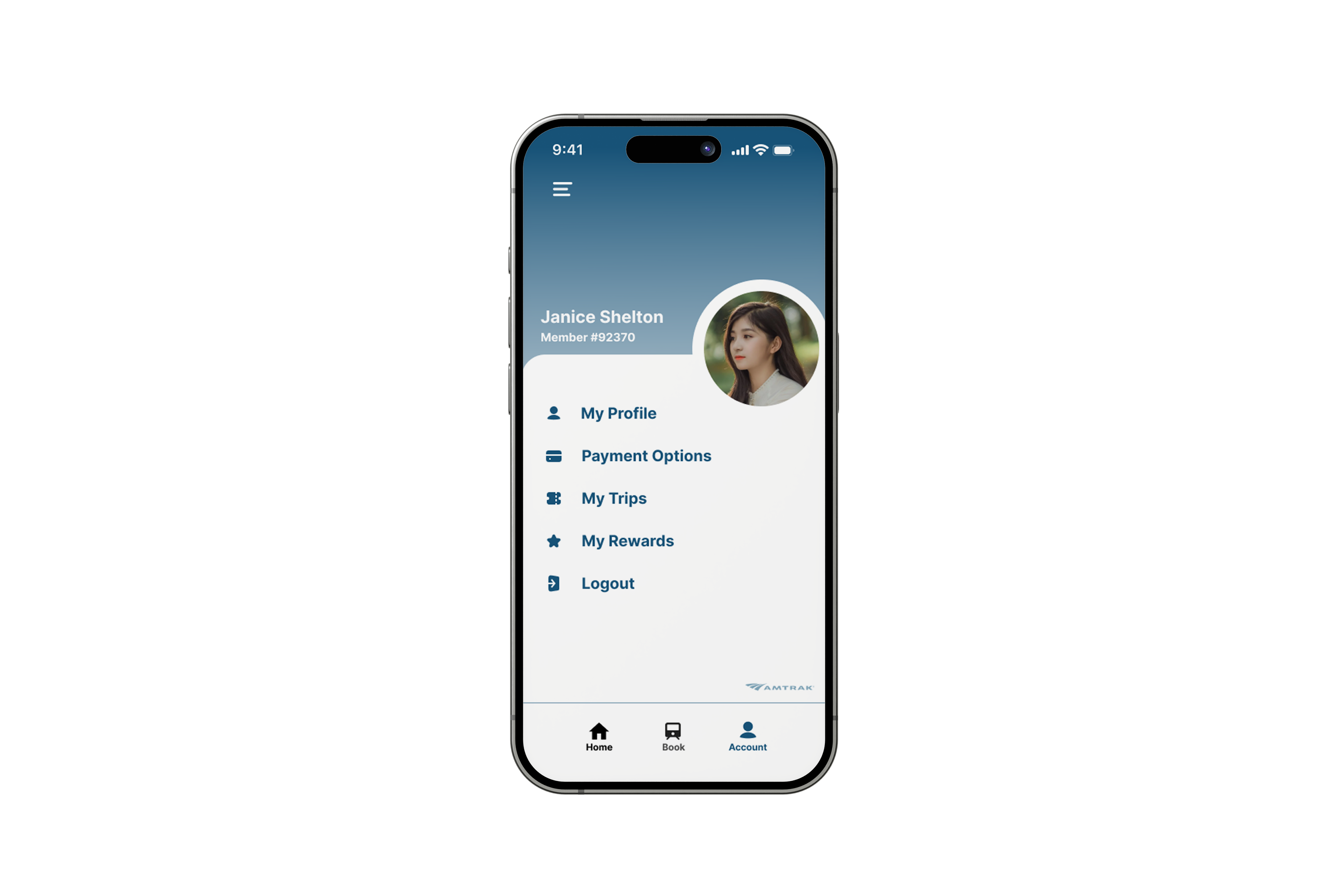
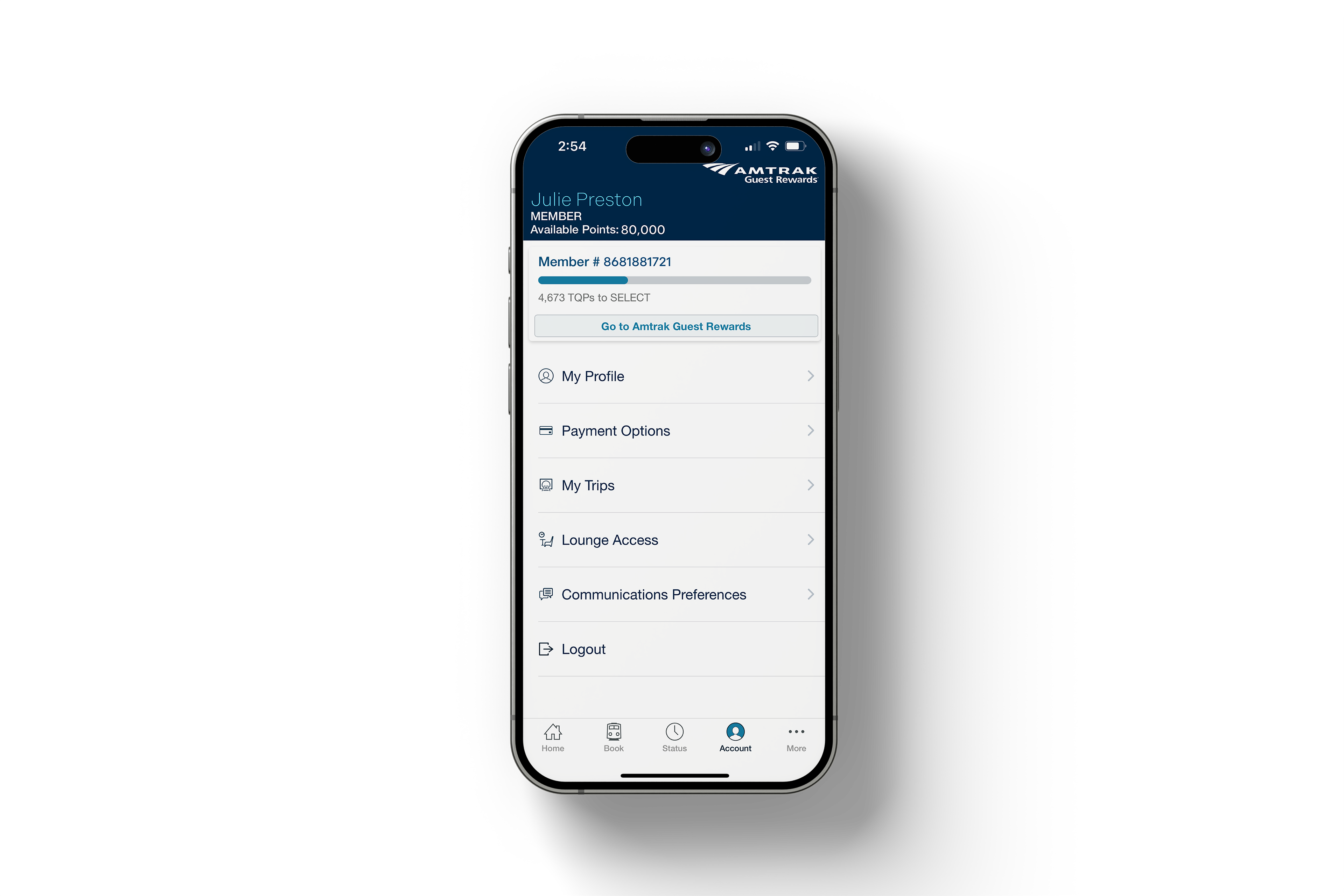
Profile
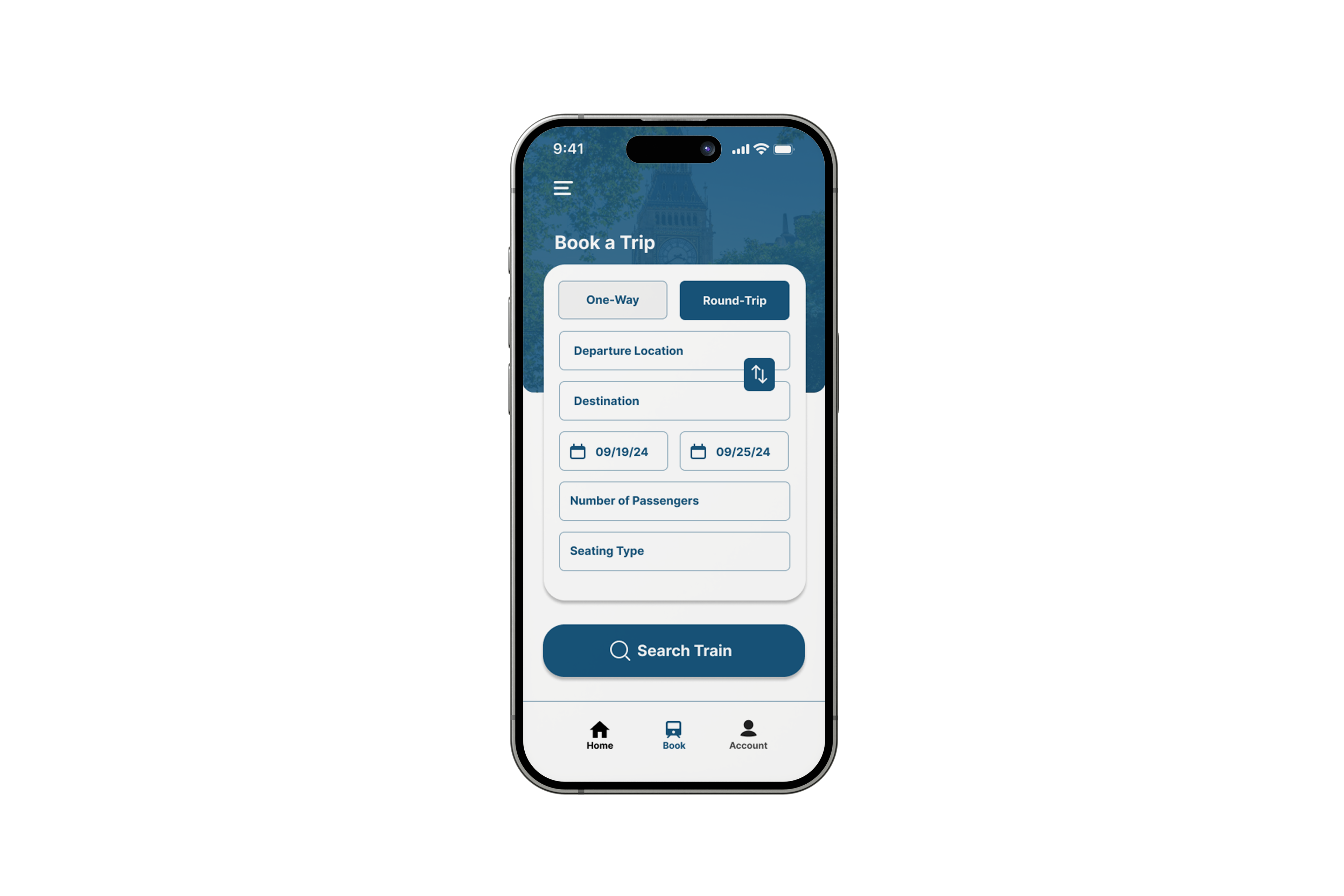
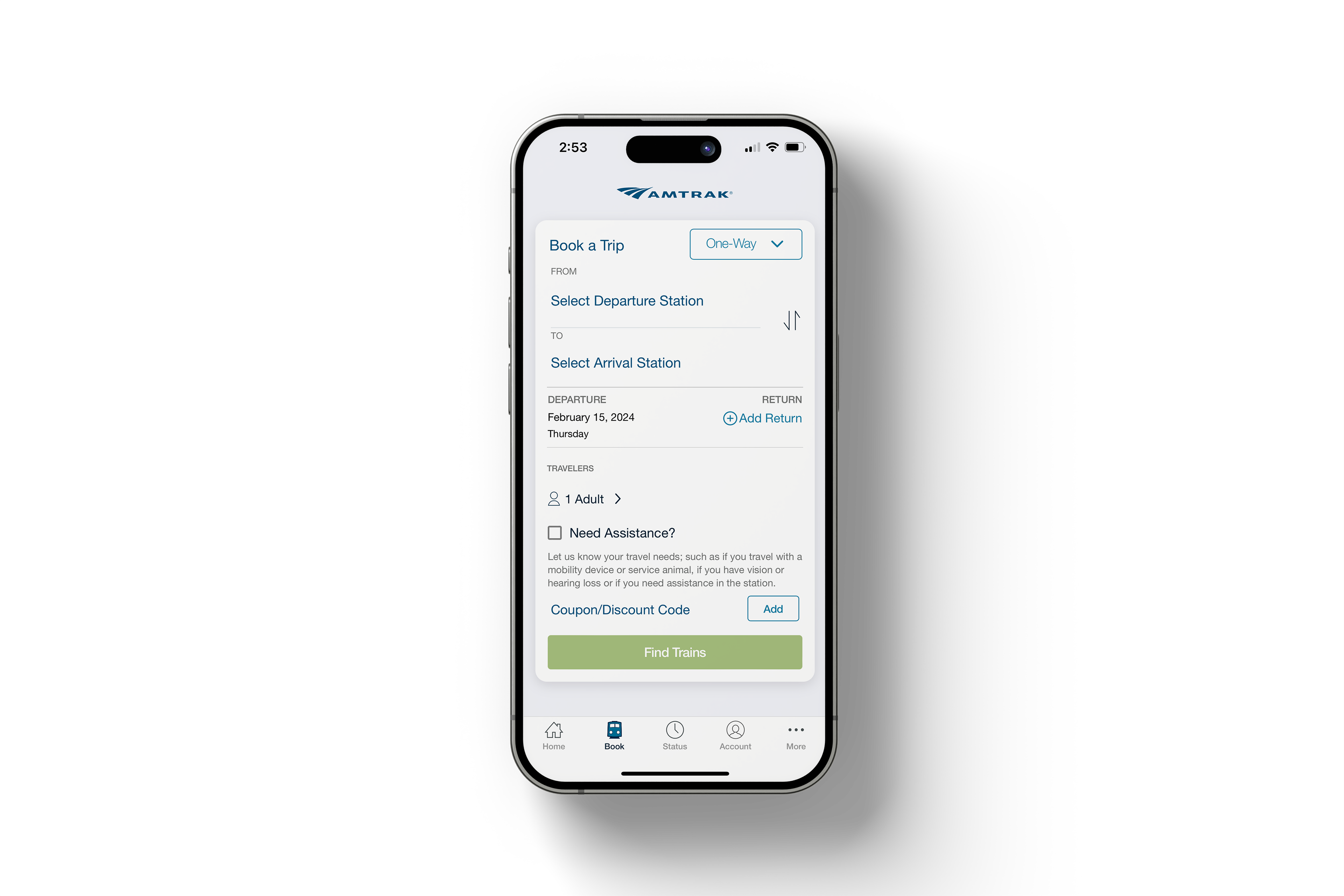
Booking
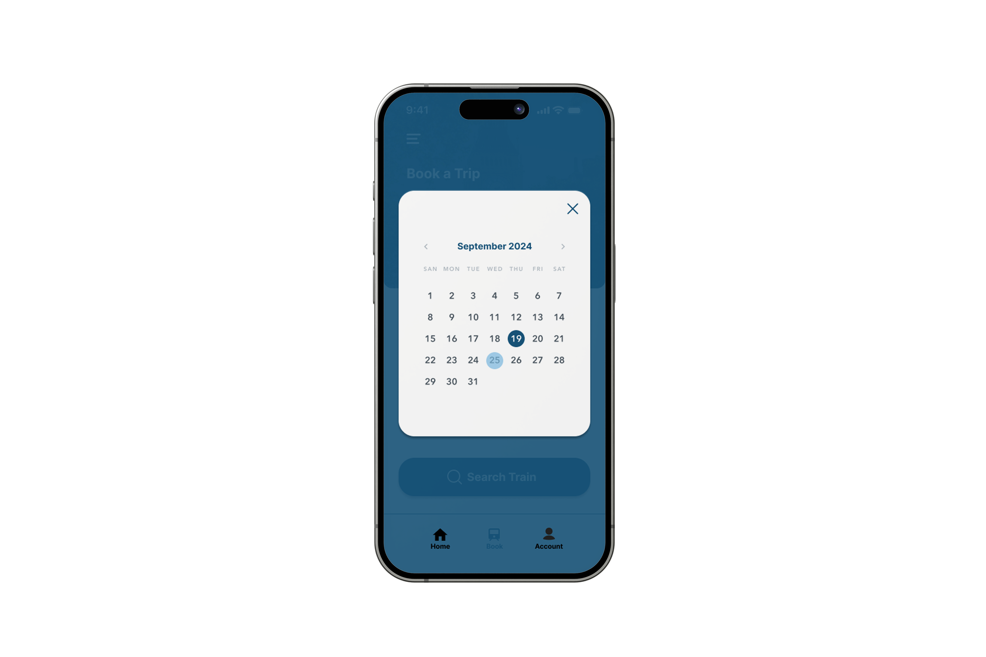
Calendar
Old Screen Issues
Old Home Screen
Old Booking Screen
Old Profile Screen
01. Issues
- Confusing overlay
- Cluttered and too much information
- Mismatched buttons and text size
02. Solution
- Simplify the overall interface/User-friendly navigation
- Get rid of excess information that clutters the space
- Organize and add visuals to make it more welcoming
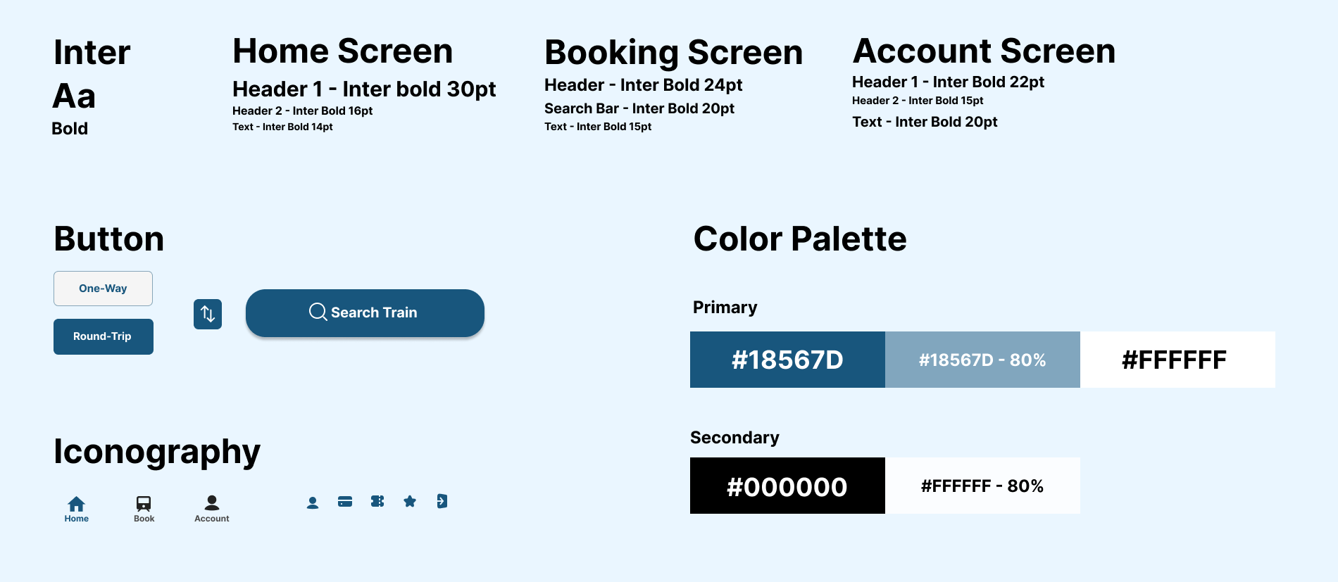
Style Guide
After the redesign, navigation is easy, eliminating potential stress when booking tickets.